
How to Read a Stock Chart Without Getting Lost
Navigating the world of investing requires a solid grasp of market tools. Stock charts are fundamental for anyone making investment decisions. These visual tools display trading activity, showing price behavior through supply and demand.
Many new traders feel overwhelmed when they first see these charts. The lines, numbers, and terms can seem complex. But this visual information is not as intimidating as it appears.
With the right guidance, you can master interpreting this data. Charts help you track historical price movements and spot potential opportunities. They are crucial for deciding when to buy or sell a stock.
This guide provides a structured path to build your confidence. You will learn to analyze market data clearly and effectively.
Key Takeaways
- Stock charts are essential visual tools for understanding market activity.
- They translate complex supply and demand dynamics into understandable information.
- Initial confusion is common, but the skill of interpreting charts can be mastered.
- These tools are vital for tracking price history and identifying trading opportunities.
- Learning to analyze a stock chart is a critical step for making informed investment decisions.
Introduction to Stock Charts
Think of a stock chart as a dynamic map that plots the journey of a company's share value over a defined period. This visual tool organizes critical market data to give you a clear picture of past and present trading activity.
What a Stock Chart Shows You
The layout is straightforward. The vertical y-axis displays the share price. The horizontal x-axis represents the time frame. This simple grid allows you to see how a stock's value changes.
You can customize the view to match your strategy. Day traders might look at five-minute intervals. Long-term investors may analyze yearly data. This flexibility makes the chart a versatile source of information.
The Role of Charts in Everyday Trading
These visuals are not just for active trading. They help you spot trends and understand market sentiment. A stock chart provides evidence of what is truly happening.
Analysts use them to connect price movements to past events. This practice helps everyone make more informed decisions about a company's future.
Understanding the Components of Stock Charts
The foundation of technical analysis lies in understanding what each component on a price chart represents. These elements work together to tell the story of a security's trading activity.
Interpreting Price, Volume, and Time
Every trading period contains four critical price points. The open, high, low, and close define the stock price movement during that time frame.
The opening price is the first trade of the session. The closing price is the last. The high and low show the trading range for that period.
Volume indicates the number of shares traded. High volume often confirms the strength behind a price move. Low volume may signal weaker conviction.
Decoding Key Chart Terminologies
Essential terms include the bid (what buyers will pay) and ask (what sellers want). The difference is called the spread.
Other important metrics are market cap, P/E ratio, and dividend yield. The 52-week high/low shows the annual price range. Beta measures stock volatility compared to the broader market.
EPS (earnings per share) and the day's range provide additional context. Understanding these terms helps you interpret chart data effectively.
How to read a stock chart without getting lost
The journey to confident chart interpretation starts with breaking down complex visuals into manageable pieces. Many beginners feel overwhelmed by the sheer amount of data presented. A systematic approach transforms confusion into clarity.
Navigating Complex Data with Ease
Begin with the fundamental building blocks. Master basic price terms like open, high, low, and close. Understanding these four data points gives you immediate context for any trading period.
Progress to essential metrics such as dividend yield and P/E ratio. These numbers provide deeper insight into a company's financial health. They help you assess value beyond simple price movements.
Choose charts that match your investment horizon. Long-term investors should focus on daily or weekly timeframes. Day traders benefit from intraday charts showing minute-by-minute activity.
Start with simplified platforms like Google Finance. These tools present clean, digestible information. Gradually advance to more complex charting software as your skills develop.
The key is progressive learning. Avoid using every indicator at once. Build your expertise step by step to make informed decisions confidently.
Exploring Different Chart Types for Trading
Selecting the right chart is a critical first step in your technical analysis. Each type offers a unique perspective on market data. Understanding their differences helps you choose the best tool for your strategy.
These visual tools transform raw numbers into actionable insights. They help you see patterns and make informed decisions.
Line Charts for Trend Visualization
Line charts provide the simplest view of a stock's performance. They connect the closing prices for each period with a single, continuous line. This creates a clean, easy-to-follow path.
This type of chart is excellent for identifying long-term trends. It strips away the noise of intraday price swings. You get a clear picture of the overall direction.
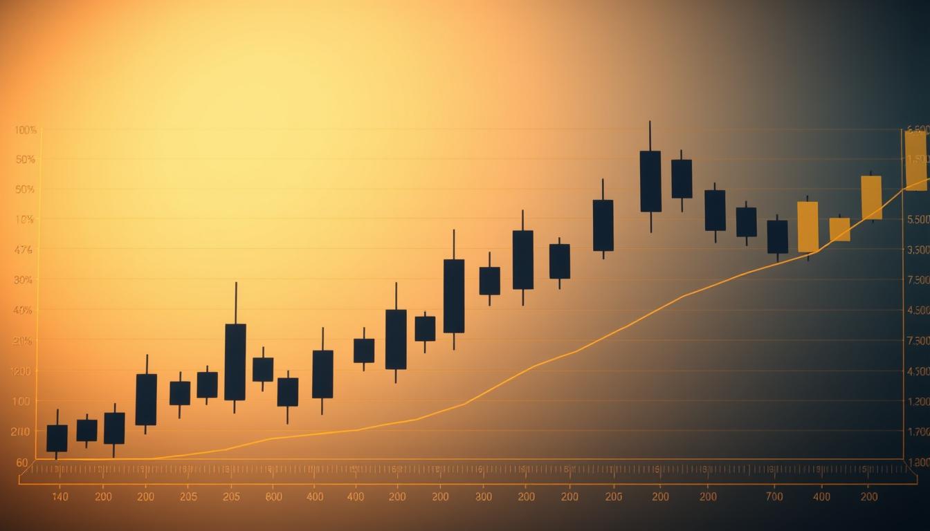
Bar and Candlestick Charts Explained
Bar charts deliver more detailed information for each trading period. A single bar displays the open, high, low, and close prices. The vertical line shows the full price range.
Candlestick charts are a popular variation. They use colored bodies to instantly show market sentiment. A green body means the price closed higher than it opened.
A red body indicates a closing price lower than the open. The thin lines, or wicks, show the high and low extremes. This makes assessing price action very efficient.
| Chart Type | Best For | Data Shown | Visual Clarity |
| Line Chart | Quick trend identification | Closing prices only | High |
| Bar Chart | Analyzing price volatility | Open, High, Low, Close | Medium |
| Candlestick Chart | Reading market sentiment | Open, High, Low, Close | Very High |
Reading Price Trends and Patterns
Mastering price trends and patterns is the next logical step in your technical analysis journey. These formations provide critical insights into market sentiment and potential future movements.
They help you understand the ongoing battle between buyers and sellers.
Identifying Uptrends, Downtrends, and Reversals
An uptrend is confirmed by a series of higher highs and higher lows. This pattern shows that buyers are consistently pushing the stock price upward.
Conversely, a downtrend features lower highs and lower lows. This indicates that sellers are in control.
Spotting a potential reversal requires confirmation. Look for at least two steps, like a higher high followed by a higher low, to confirm a new uptrend is beginning.Common patterns like triangles and flags offer visual signals for these changes. They highlight key moments where the price may break out.
Understanding Support and Resistance Levels
Support and resistance are fundamental psychological levels. Support acts as a floor where a falling price often stops and reverses.
At this level, sellers become unwilling to sell lower, and buyers see value.
Resistance acts as a ceiling, halting upward price movement. Breaking through resistance requires strong buying pressure.
These levels provide practical entry and exit points. You might consider buying near support and selling near resistance.
When a stock tests a support or resistance level multiple times, its significance increases.
Using Technical Indicators and Moving Averages
Moving averages represent one of the most fundamental technical indicators used by market participants. These tools smooth out price data to reveal the underlying trend direction more clearly.
Incorporating Volume and Average Crossovers
Simple moving averages (SMAs) calculate the average price over a specific period. Exponential moving averages (EMAs) give more weight to recent prices.
Common periods include the 50-day and 200-day moving averages. When the shorter-term average crosses above the longer-term one, it creates a bullish signal known as a golden cross.
Conversely, a death cross occurs when the 50-day crosses below the 200-day line. These crossover signals gain strength when accompanied by high trading volume.
Combining Multiple Indicators Effectively
Successful traders rarely rely on single indicators. Combining moving averages with volume analysis provides more reliable signals.
Too few tools can lead to false trading points. Too many create analysis paralysis. Find the right balance for your market approach.
Start with a simple system using volume and two moving averages. Refine your strategy as you gain experience with different market conditions.
Tips and Best Practices for Analyzing Stock Charts
The difference between successful and struggling traders often lies in their analytical methodology. Developing effective habits prevents common pitfalls that undermine trading performance.
Strategies for Avoiding Analysis Paralysis
Too much information can paralyze your decisions. Find the right balance between having enough data and overwhelming yourself. Start with a few reliable indicators rather than every available tool.
Wait for confirmation from multiple sources before acting. A single signal may prove false. Maintain perspective by remembering that price swings are normal in any market.
Always check the scale on your charts. What appears dramatic may be insignificant when you examine the actual price range. Match your analysis to your investment horizon for maximum effectiveness.
Learning When to Act on Chart Signals
Timing is crucial for profitable trading. Entering too early or too late can turn opportunity into loss. Look for strong confirmation before executing any trade.
For example, wait for a stock to close above resistance with substantial volume. Don't buy immediately when it touches the level. Have your exit strategy predetermined before entering any position.
Repeated failures to break through key levels often signal weakness. The Nike example shows how failing at $130 resistance preceded a sustained decline. Use such patterns to guide your decisions.
| Analytical Approach | Information Level | Decision Quality | Time Efficiency |
| Overloaded Analysis | Too many indicators | Paralyzed decisions | Wasted time |
| Balanced Approach | Key metrics only | Confident actions | Optimal use |
| Minimalist Method | Essential data points | Quick decisions | Maximum efficiency |
Conclusion
Your ability to interpret market data effectively hinges on a structured learning process. Begin with basic price terms like open, high, low, and close. Progress to essential metrics such as volume and P/E ratios before tackling pattern recognition.
Remember that different chart types serve distinct purposes. Line charts offer clean trend visualization, while candlestick charts provide detailed sentiment analysis. Choose tools that match your investment horizon and experience level.
Technical indicators like moving averages become powerful when combined for confirmation. Focus on key support and resistance levels to avoid analysis paralysis. These points offer practical entry and exit decisions.
Regular practice builds true proficiency in reading stock charts. You now possess the foundation to make informed trading choices confidently, transforming complex information into actionable insights.

0 Comments Comments