
5 Sneaky Ways Grocery Stores Make You Overspend
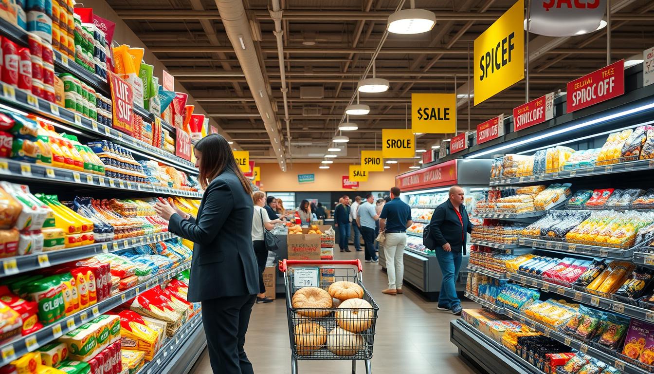
You walk in for milk, eggs, and bread. Then you spot a kombucha you “should try,” a $15 candle that smells like a spa, and a family-sized bag of chips “for the weekend.” By the time you hit the register, impulse buying at the grocery store has quietly doubled your cart. That’s not bad self-control—it’s design. Many grocery store tricks come from careful testing: store maps that pull you deeper into aisles, shelf placement that favors high-margin brands, and promotions that feel urgent. These grocery store marketing tactics are built to nudge you past your list and closer to a bigger total. In this guide—5 Sneaky Ways Your Grocery Store Tricks You Into Overspending—you’ll see how the tactics show up during a normal U.S. grocery run and how to respond in real time. You’ll learn how to stop overspending on groceries by sticking to your list, scanning beyond eye-level shelves, and treating end caps like ads, not automatic deals. For a deeper look at the wider playbook behind retail nudges, start with outsmarting retail tricks. Imagery credits for the full article build: 123rf.com; Prostock-Studio / Getty Images.
Key Takeaways
- You often overspend because grocery store tricks are planned, tested, and repeated.
- Impulse buying at the grocery store rises when you spend more time in aisles and checkout lines.
- Grocery store marketing tactics often push high-profit items to the most visible spots.
- End caps and “special displays” can be attention grabs, not real bargains.
- To learn how to stop overspending on groceries, shop your list and compare prices beyond eye level.
- Knowing 5 Sneaky Ways Your Grocery Store Tricks You Into Overspending helps you keep control of your budget.
Why grocery stores are designed to make you spend more
You walk in for basics, but the store is built to nudge your decisions. This is supermarket design psychology at work: the goal is sales, not speed. Even with a list and coupons, you can still feel pulled off track by small prompts that don’t look like pressure.
Rachel Cruze has warned that disciplined shoppers can still lose money to marketing. The shift is subtle: you think you’re choosing freely, yet the environment keeps presenting “easy adds” that feel harmless in the moment.
Shopper psychology: how “small extras” snowball at the register
In a shopper psychology grocery store, the first few minutes matter. You grab a coffee, a “new” snack, or a special flavor you didn’t plan on. By the time you reach essentials, you may have already tossed at least two extras into your cart. Those add-ons feel minor because each one is a low-stakes choice. But they stack fast, and you notice it most when you face overspending at checkout and the total jumps higher than expected.
Why longer time in the store creates more chances for impulse buys
The longer you stay inside, the more chances you get to say yes to impulse purchases. Extra laps around the aisles mean more displays, more price tags, andmore “why not?” moments. A long route isn’t an accident; it increases exposure.
Time also wears down your focus. When you’re tired or hungry, quick decisions replace careful ones, and your list starts to feel flexible.
How subtle cues (placement, promotions, environment) shape your choices
Grocery store cues are often physical and predictable. Staples like milk, eggs, and bread are commonly placed toward the back, so you pass tempting categories first. Pricier brands tend to sit at eye level, while store brands and lower-cost options are often higher or lower on the shelf. Promotions can be just as guiding. End caps can look like deals even when the price is average, and multi-buy tags like “two for $5” can push you to buy more than you planned. When something is “on sale” every time you visit, it can blur what a real discount is.
Even the vibe plays a role. Many stores lead with a colorful produce “rainbow,” then use lighting and music to slow your pace and encourage browsing. All of it supports supermarket design psychology, creating more moments where impulse purchases feel like smart, small choices.
| Cue type | What you notice | What it nudges you to do | Common result |
| Placement | Essentials placed deeper in the store; eye-level brands stand out; kid-focused items sit lower | Add items before you reach your list staples | More unplanned picks and higher basket total |
| Promotions | End caps, bold tags, “two for $5,” and “always on sale” signs | Buy multiples or assume a deal without comparing unit price | Extra quantity and faster overspending at checkout |
| Environment | Bright produce at the entrance, comfortable lighting, steady music | Walk slower, browse longer, and explore new products | More exposure and more impulse purchases over time |
5 Sneaky Ways Your Grocery Store Tricks You Into Overspending
You can walk in with a list, a coupon, and a plan—and still leave with a bigger receipt. That’s the point of 5 Sneaky Ways Your Grocery Store Tricks You Into Overspending: it’s a roadmap for spotting the nudges before they turn into extra items in your cart. This section previews the five tactics you’ll see throughout the store: layout that pulls you deeper, eye-level placement that favors pricey brands, end caps that look like deals, pricing tactics that push “more,” and free samples that lower your guard. You’ll also notice how atmosphere cues like music and lighting, plus cross-merchandising, can quietly grow your basket. If you’re stuck in the grocery list vs impulse buys cycle, the fix starts with naming what’s happening. Rachel Cruze advises you to notice the tactics so you canthink through your purchase decisions more carefully. Use perks you actually want—like a birthday coupon or 10% off $150+—but keep your cart tied to what you need.
How to recognize tactics even when you shop with a list
Lists help, but they aren’t armor. Stores place your basics far apart and fill the path with bright displays, “limited-time” signs, and snack shelves that invite detours. The longer you browse, the more likely you are to add “just one thing.”
When you feel pulled off course, pause and do a quick check: is this item on your list, or is it reacting to a shelf, a sign, or a sample? That single question supports planned vs unplanned purchases and keeps your grocery budget tips practical, not perfect. If you want more context on how these tactics show up in real aisles, this breakdown of sneaky grocery store tricks lines up with what many shoppers notice after the fact.
What “planned purchases” vs. “unplanned add-ons” look like in real life
Planned purchases are the staples you meant to buy because they match meals at home. Think milk, eggs, bread, and cheese—the kind of items that anchor breakfast and quick dinners. Unplanned add-ons are the “while I’m here” grabs, like kombucha, a $15 candle, or family-sized chips that weren’t part of any meal plan. Those add-ons often sneak in during the trek to the back of the store, when you pass end caps, bakery smells, and stacks of seasonal items. That’s where grocery list vs impulse buys becomes a real-time tug-of-war, and planned vs unplanned purchases start to blur.
| Tactic you’ll learn to spot | What it looks like in the aisle | How it drives overspending | Fast response you can use |
| Strategic store layout | Milk, eggs, bread, and cheese placed deeper in the store | More walking past tempting categories increases unplanned add-ons | Shop perimeter with purpose, then hit only the aisles your list requires |
| Eye-level product placement | Premium brands at eye height; store brands lower or higher | Your first glance lands on higher-margin options | Scan one shelf up and down before choosing |
| End caps and special displays | Flashy stacks at aisle ends with bold promos | Creates urgency and distracts from unit price checks | Compare price per ounce before it goes in the cart |
| Pricing tactics | “2 for $5,” big-size bundles, or “must-buy” deals | Pushes more quantity than you planned to use | Buy the amount you’ll finish, not the amount the sign suggests |
| Free samples | A taste of a new snack or drink near a display | Makes you more likely to buy something you didn’t plan | Try it if you want, then wait one aisle before deciding |
- Planned purchases: items tied to meals you already expect to make at home.
- Unplanned add-ons: items triggered by placement, promos, or cravings in the moment.
- Grocery budget tips: small rules you can repeat, even on busy shopping days.
Store layout tricks that pull you past temptations
You can walk in with a short list and still leave with a full cart. That’s not a lack of willpower. It’s supermarket layout psychology at work, built around grocery store layout tricks that keep you moving, looking, and reacting.
Why essentials like milk, eggs, bread, and cheese are often placed toward the back
Many stores rely on essentials placed in back of store to stretch your trip. When milk and bread sit far from the entrance, you pass snack shelves, end caps, and cold cases that weren’t on your mind at home. By the time you reach eggs, cheese, or bread, you’ve already walked through dozens of choices. That extra time increases product exposure, so “just one more item” feels easy to justify.
How checkout lanes and high-traffic paths increase last-minute add-ons
Checkout is designed for speed, but it’s also a pressure point. The impulse buys checkout lane setup puts candy, gum, and small drinks right where your eyes land while you wait. Those high-traffic aisles leading to the registers do the same job earlier. They funnel most shoppers past the most promoted items, so you see the same categories again and again.
How navigating more aisles exposes you to more promotions
The longer your route, the more promotions you meet. Even if you stick to your list, weaving through extra aisles means more price signs, bundle offers, and bright packaging competing for attention. If you’re shopping on a tight budget, that constant nudge can be tough. Supermarket layout psychology counts on quick decisions, especially when you’re hungry, rushed, or trying to stretch a week’s worth of meals.
| Layout move you experience | What you notice in the moment | What it nudges you to do |
| Essentials placed in back of store | You walk farther for milk, eggs, bread, and cheese | Add “extras” after repeated exposure to snacks and promos |
| High-traffic aisles near main routes | More end caps and bigger signs on your path | Swap to promoted items you didn’t plan to buy |
| Impulse buys checkout lane | Small treats within arm’s reach while you wait | Make quick, low-cost add-ons that stack up fast |
Eye-level shelf placement that steers you to pricier picks
You can walk in with a list and still drift toward the costliest choice. That’s because shelf placement psychology works on autopilot: you grab what’s easiest to see, reach, and compare fast. In an eye-level pricing grocery store setup, the best deal is often the one you have to look for.
Why the most expensive brands often sit at eye level
When name brands eye level meet your gaze, they feel like the default pick. You don’t have to bend, stretch, or scan, so your brain treats that spot as the “main” option. Many manufacturers also pay for prime shelf space because it lifts sales in a simple, repeatable way.
Where store brands and lower-cost options are commonly placed (top and bottom shelves)
Lower prices are often harder to spot because the shelf isn’t neutral. You’ll commonly find store brands on bottom shelf or pushed up high, where fewer shoppers linger. This makes it easier to miss a cheaper twin and choose a pricier version without meaning to. If you want to slow the pattern, take one extra beat and scan from top to bottom. That small move can make it less likely you’ll pay more just because the layout made the cheaper item feel “hidden.”
How kid-targeted products can be positioned at children’s eye level
Kids get their own version of the same trick. Kids cereal placement is often lower, lined up with a child’s sightline, with bold colors and familiar characters. When the box faces them first, it can spark a quick ask before you’ve compared price per ounce.
| Shelf zone | What you often see there | How it nudges your cart | Quick counter-move |
| Eye level | name brands eye level and newer “premium” options | Feels like the standard choice; fastest to grab and compare | Check unit price, then look one shelf up and down |
| Bottom shelf | store brands on bottom shelf and larger value sizes | Easy to overlook if you shop upright and move fast | Do a quick crouch scan before deciding |
| Top shelf | Extra flavors, slower sellers, or less-advertised alternatives | Requires effort, so fewer shoppers compare | Look up for duplicates with lower cost per ounce |
| Child eye level | kids cereal placement and bright snack items | Prompts requests and “just this once” add-ons | Decide on cereal before the aisle; stick to your pick |
End caps and “special displays” that look like deals but aren’t
You’ve seen them at the end of an aisle, stacked high and hard to miss. These end cap displays grocery store teams build are designed to interrupt your routine and steer your cart. They can feel like a shortcut to savings, but they’re really a spotlight. Before you grab, it helps to know what’s driving the display.
How end caps grab attention with seasonal, new, or “limited-time” messaging
End caps often lean on seasonal displays, new flavors, and bold “now” messaging. Bright colors, big stacks, and fast-to-read signs create urgency without saying much. Limited-time promotions do a lot of the work here. When something feels temporary, you’re more likely to toss it in “just in case,” even if it wasn’t on your list.
Why end-cap placement doesn’t guarantee a discount
It’s easy to assume the front-and-center spot means a bargain, but end caps not always on sale. Some items sit there at full price because the placement itself drives attention. A quick scan of the unit price can keep you grounded. Clearance is also often handled differently, with discontinued items more likely to end up toward the back instead of on a high-traffic end cap.
| What you notice | What it can mean | What to check before you buy |
| Big stack near the aisle end | High-visibility push, not always a markdown | Unit price and shelf price elsewhere in the aisle |
| Holiday colors and themed signage | Seasonal displays meant to speed up decisions | Compare with your usual brand and size |
| “New” or “only here for a short time” | Limited-time promotions that trade urgency for price scrutiny | Ingredients, size, and whether you’ll use it soon |
| Two items placed together from different aisles | A nudge to buy an extra item you didn’t plan on | Whether the “pairing” actually saves you money |
How manufacturers pay for premium placement to boost sales
That prime location can be part of a business deal. In many stores, brands compete for the end-cap spotlight through paid product placement, because it can lift sales fast. This is why a featured soda, cereal, or snack may be showcased even when the price is ordinary. When you treat the display as an ad, you’re more likely to pause, compare, and keep control of your cart.
Pricing tactics that encourage you to buy more than you need
Price tags can look simple, but they’re packed with nudges. Some of the most effective grocery pricing tricks rely on speed: you scan, assume it’s a deal, and toss more into your cart.
Multi-buy pricing (like “two for $5”) and why you should read the fine print
You’ve seen the soup sign: multi-buy grocery deals like “two for $5” feel like a clear bargain. The catch is the two for $5 fine print, which can spell out whether you must buy two to get the lower price. If you don’t pause to read the tag, you’re more likely to “stock up” just to avoid missing out. That’s how a quick stop turns into pantry loading you didn’t plan for.
When you can often still get the same per-item price without buying multiples
Many stores still ring each item at $2.50, even when the sign pushes a bundle. A fast unit price comparison keeps you focused on what you need, not what the sign wants you to buy.
| Sign on the shelf | What to check | What it can mean for your cart |
| “2 for $5” on canned soup | two for $5 fine print on the tag | You may get $2.50 each, or you may need two to qualify |
| “Buy 3, save $2” on snacks | Unit cost after the discount | The “deal” can raise your total even if the per-item price drops |
| “10 for $10” on yogurt | unit price comparison vs. a single unit | You might pay $1 each without buying 10, but the sign pushes volume |
How “always on sale” messaging can blur what a real deal looks like
Always on sale marketing trains you to buy now instead of later. Personal finance author Dave Ramsey often points to retailers like Hobby Lobby and Anthropologie as examples of constant promo noise, where “sale” starts to feel normal. The same pattern shows up in grocery aisles. When labels scream discounts every visit, it gets harder to spot a true value, and grocery pricing tricks work better because you stop questioning the baseline price. Try a simple habit: keep a short list of must-have items and wait for a real drop. Pair that patience with a unit price comparison, and multi-buy grocery deals won’t decide what ends up in your cart.
Cross-merchandising that sparks unplanned “perfect pair” purchases
A cross-merchandising grocery store doesn’t just stock items by category. It builds little “bundles” along your route, so your brain connects them fast.
With complementary product placement, you stop thinking in single items and start thinking in meals, snacks, and upgrades. That’s how perfect pair purchases happen without a plan. Chocolate syrup shows up next to ice cream even though it doesn’t need the freezer. Marshmallows sit with graham crackers, ready for a quick s’mores grab. In impulse add-ons grocery aisles, the pairings can look “helpful,” not pushy. Whipped cream may be displayed alongside produce, so berries suddenly feel incomplete. Red pepper flakes near frozen pizza makes a basic dinner seem like it needs a finishing touch. You can also see the same cross-category shopping mindset in multi-category finds, where budget-friendly picks across beauty, fragrance, and home blur the line between “came for” and “might as well.” In groceries, that blur is the goal: you reach for cheese, then notice fancy crackers, olives, or a spread that feels like the natural next step.
| What you came for | Complementary product placement you notice | How it shifts your cart |
| Ice cream | Chocolate syrup placed nearby | Adds a topping that feels essential, not optional |
| Graham crackers | Marshmallows paired beside them | Turns a pantry item into a “kit” you buy in full |
| Berries | Whipped cream displayed alongside produce | Upgrades fruit into a dessert purchase |
| Frozen pizza | Red pepper flakes set close to the freezer case | Prompts a “restaurant-style” add-on you didn’t list |
These setups often land on bright end caps, where the display sells a complete “solution” in one glance. In a cross-merchandising grocery store, the add-ons don’t read like extra spending, even when they stack up fast across the trip.
Free samples that lower your resistance to spending
You spot a small cart near the aisle, and the offer feels harmless. A sip of juice, a bite of sausage, or a little cup of cheese can make your next choice feel easier. That’s the quiet engine behind grocery store sampling psychology: once you taste it, you picture it at home.
Why sampling can increase the chance you’ll buy (including claims of sales lifts up to 2,000%)
A sample does more than prove flavor. It removes uncertainty about texture, freshness, and whether your family will eat it. That’s one reason brands and stores say free samples increase sales, with some promotions even claiming lifts up to 2,000%. It also shortens your “should I?” moment. When the product is already in your mouth, the decision can feel like a simple next step instead of a risk.
| Sampling moment | What you tend to think | What you often do next |
| Little cups of cheese | “This would work on a snack board.” | Add crackers, fruit, or deli meats to your cart |
| Sips of juice | “This tastes better than the one I buy.” | Compare sizes, then grab the larger bottle |
| Bites of sausage | “Dinner just got easier.” | Pick up pasta, sauce, or buns nearby |
Reciprocity effect: how “free” can create pressure to purchase
Even when you didn’t ask for it, “free” can feel like a favor. The reciprocity effect shopping kicks in when you want to be polite or fair after accepting something. You may feel a subtle push to put the item in your cart, even if it wasn’t on your list. This is why a friendly offer and a short pitch work so well together. In grocery store sampling psychology, that social moment can matter as much as the taste.
How sampling can lead you to spend more overall, even beyond the sampled product
After you sample, you often keep browsing with less friction. That’s where impulse buying after samples shows up: one new item leads to “perfect add-ons,” and your basket gets heavier in small steps. Sometimes you don’t even buy the exact food you tried. You just feel more open to treats, upgrades, and extra stops, which is another way free samples increase sales across the store.
Lighting, music, and atmosphere that keep you shopping longer
You may think you’re moving fast, but the store is setting the pace. When grocery store music affects shopping, it often does it in quiet ways. Slow, soft tracks can make you stroll, scan, and compare. Faster songs can push you forward while you still toss in small extras. At the same time, retail lighting tactics guide your eyes. Bright, clean light makes displays look crisp and “just stocked.” It’s not about tricking you with words; it’s about shaping what looks fresh, safe, and worth adding to your cart. Many stores start you in color, and that first impression matters. Strong produce lighting can make greens look vivid and berries look glossy. That “healthy start” can tilt your mood, which is a big piece of store atmosphere psychology. When you feel like you made a smart choice early, it’s easier to justify a treat later. Then you hit the warm zones. Bakery lighting is often softer and golden, which flatters breads and pastries. It makes the crust look deeper and the icing look smoother, so you slow down and browse more than you planned.
| Sensory cue | What you notice | How it can change your behavior |
| grocery store music affects shopping | A calm or upbeat rhythm in the background | You linger longer with slow music, or move faster while still grabbing add-ons with upbeat music |
| retail lighting tactics | Brighter aisles and spotlighted displays | Your attention sticks to featured areas, which increases time near promos and end caps |
| produce lighting | Fruits and vegetables that look extra vibrant at the entrance | You feel “on track,” which can loosen your guard on less-healthy impulse items later |
| bakery lighting | Warm glow on bread, cookies, and cakes | You slow down, imagine taste and smell, and add items that weren’t on your list |
| store atmosphere psychology | A steady mix of sound, light, and comfort | You stay in the store longer, which raises your odds of extra purchases |
If you want a simple defense, pay attention to your pace. If you notice you’re drifting, reset: check your list, take a breath, and keep moving. These cues are designed to feel normal, which is why they’re easy to miss.
Conclusion
Grocery stores don’t leave your bill to chance. The layout pushes staples like milk and eggs to the back, so you pass more tempting aisles. Eye-level shelves spotlight higher-priced brands, while end caps can look like deals even when the price is normal. Then come the pressure points: multi-buy signs, “always on sale” tags, and free samples that make it easy to toss in “just one more.” Add cross-merchandising—chips next to salsa, pasta near sauce— and a calm mood from music and bright produce lighting. If you’ve wondered how to stop overspending at the grocery store, this is the playbook you’re walking through. You can still shop smarter save money with a few steady habits. Make a list and treat the walk to the back as a mission, not a browse. Scan shelves above and below eye level for store brands, and don’t trust end caps without comparing unit prices—simple grocery budgeting tips that help you avoid impulse buys. As Rachel Cruze warns, these tactics are built to lift store sales, but they can chip away at your finances. Buy only what you can pay for today, and focus on what you actually need. You’re not “bad at budgeting”—you’re shopping inside a system designed to nudge spending, and awareness helps you stay on budget next trip.

0 Comments Comments